
Data visualization with Matplotlib

Organizations collect and analyze vast amounts of data from sales revenue, marketing performance, customer interactions, inventory levels, production metrics, staffing levels, costs, etc. This can be too much data that it is impossible to effectively understand and evaluate it to address business decisions for effective outcomes. This is where data visualization comes in.
Data visualization makes complex data understandable using standard visual graphics like charts, plots, etc. We will explore the Matplotlib data visualization package in this article.
Matplotlib is an open-source Python library for making 2D visualizations from NumPy arrays and Pandas DataFrames.
Installing Matplotlib
If you have Python and pip installed, run pip install matplotlib from your terminal or cmd:
pip install matplotlibOn Anaconda Prompt run:
conda install matplotlibFollow this Python for data science tutorial to see how to install packages in different environments.
Getting started with Matplotlib
After installation of the package, import it into your project to start using it:
import matplotlib.pyplot as pltAlso, import the NumPy package:
import numpy as npWe will work with NumPy because, in Matplotlib, we are constrained to working with lists. Most Python sequences are converted to NumPy arrays in the backend, which makes sense for numerical processing.
Overview of the Matplotlib architecture
Matplotlib has a top-level object called Figure that has and manages all elements in a plot. Matplotlib provides a way of representing and manipulating the Figure which is separate from rendering this Figure to a user-interface window. This enables us to build features and logic into the Figure while keeping the backend relatively simple.
To accomplish this, Matplotlib has a three-layer stack where a layer that sits on another can communicate with the layer below it, but the layer below has no information about the one above. The layers from bottom to top are:
0. Backend layer
This layer implements the abstract interface classes, which are:
FigureCanvasthat encapsulates the concept of a surface to draw onto, e.g., a paper.Rendererwhich provides the drawing interface for putting ink onto the canvas.Eventwhich represents the underlying UI events, e.g., picking a data point or manipulating some aspect of the figure.
1. Artist layer
Everything that you see on a Matplotlib Figure is an artist instance. This may include the titles, lines, images, labels, etc. Artists can be of two types:
- Primitive artists (
Text,Circle,Rectangleetc.). - Composite artists - A collection of artists(
Axis,Tick,Axes,Figureetc.).
Most of the plotting in Matplotlib happens in the Axes artist. It has most of the graphical elements which compose the plot, like axis lines, grid, and ticks. It also has helper methods for creating primitive artists.
As we'll discuss later, this layer provides an Object Oriented API(OO) for plotting graphs with great flexibility.
2. Scripting layer
This is the topmost layer in Matplotlib for end users with little programming experience. It provides a lighter scripting interface provided by the matplotlib.pyplot interface(functional interface) to simplify common tasks.
Plotting in Matplotlib
We have encountered two approaches we can plot graphs with from the architecture. These approaches are:
pyplotinterface approach(state-based functional interface).- Object Oriented approach (OO, stateless interface).
Matplotlib pyplot interface
The matplotlib.pyplot module makes Matplotlib resemble MATLAB's way of generating plots. pyplot commands make changes and modifications to the same figure. The module keeps track of the state(i.e., current figure, plotting area) when we call methods that modify the figure. It is mainly helpful for creating simple and interactive plots quickly and easily.
It is straightforward to create a plot with pyplot:
x = np.linspace(0,2*np.pi,50)
y = np.sin(x) + x
plt.plot(x, y)
plt.show() 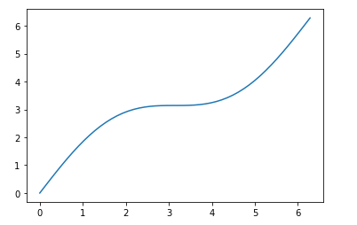
The plot() function is used to draw the points, also called the markers. In our case, it will draw a line on points x and y, representing the x and y-axis.
The show() function displays or prints the figure. However, it is unnecessary when plotting in an IPython shell or Jupyter notebook, and you must use it on other platforms like terminals and scripts.
Would the plot be generated if we only provided a single list inside the plot() function? Well, let's see:
arr_points= np.array([20, 30, 40, 50, 60])
plt.plot(arr_points)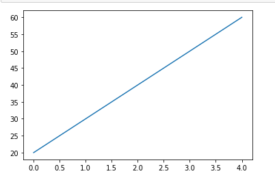
We still get our plot. It is good to note that:
When you provide only a single list, Matplotlib will assume the list is a sequence of y values and automatically generates the x values with the same length as the y values but starting from 0.
Labels and titles in pyplot
Let's look at how to add labels and titles using pyplot.
Labels
The xlabel() and the ylabel() functions set labels for the x and y axis, respectively.
Example:
x = np.linspace(50, 80, 20)
y = np.linspace(90, 300, 20)
plt.plot(x, y)

plt.xlabel('Heights in inches')
plt.ylabel('Weights in pounds')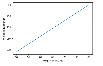
Titles
We set the titles of the plot with the title() function.
x = np.linspace(50, 80, 20)
y = np.linspace(90, 300, 20)
plt.plot(x, y)

plt.title('Relation of weight to height')
plt.xlabel('Heights in inches')
plt.ylabel('Weights in pounds')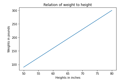
Customizing plotted lines
The plot() function can receive several arguments that enable us to customize our lines.
Line style
We use the linestyle parameter or its shorter version ls to specify the style of the plotted lines. The code below will produce dotted lines:
x = np.linspace(50, 80, 20)
y = np.linspace(90, 300, 20)
plt.plot(x, y, linestyle='dotted') # use linestyle Or ls:
#plt.plot(x, y, ls='dotted')

plt.title('Relation of weight to height')
plt.xlabel('Heights in inches')
plt.ylabel('Weights in pounds')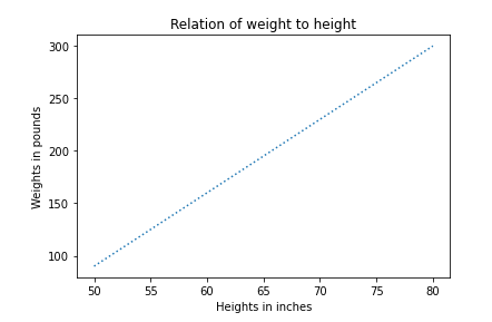
Supported line styles include:
| linestyle | description | usage |
|---|---|---|
| '-' or 'solid' | plots solid line | plt.plot(x, y, ls='-') |
| '--' or 'dashed' | plots a dashed line | plt.plot(x, y, ls='--') |
| '-.' or 'dashdot' | plots a dash-dotted line | plt.plot(x, y, ls='-.') |
| ':' or 'dotted' | plots a dotted line | plt.plot(x, y, ls=':') |
| ' ' , 'None' and '' | All draw nothing | plt.plot(x, y, ls=' ') |
Line color
The color keyword or its short-form c sets the color of the lines. The code below produces a yellow dashed-dotted plot:
x = np.linspace(50, 80, 20)
y = np.linspace(90, 300, 20)
plt.plot(x, y, linestyle='-.', color= 'y') # linestyle, color:
# SAME AS
#plt.plot(x, y, ls='-.', c='y')

plt.title('Relation of weight to height')
plt.xlabel('Heights in inches')
plt.ylabel('Weights in pounds')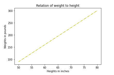
You can assign any color format in the color keyword. Below is a representation of a few color formats we can use.
| Format | Usage |
|---|---|
| RGB or RGBA values | plt.plot(x, y, color=(0.4, 0.7, 0.2, 0.8))- Passed as a tuple of float values each value in range 0 to 1 |
| Hexadecimal values | plt.plot(x, y, color='#00bb88') |
| Single character notation | plt.plot(x, y, c='y')
|
| Tableau colors | plt.plot(x, y, color='tab:green')
|
Line width
We can use the linewidth keyword or lw to specify the width of the lines. Example:
x = np.linspace(50, 80, 20)
y = np.linspace(90, 300, 20)
plt.plot(x, y, linestyle='-', color='tab:green', linewidth='15.4') # linestyle, color, linewidth:
# SAME AS
#plt.plot(x, y, ls='-.', c='tab:green', lw='15.4')

plt.title('Relation of weight to height')
plt.xlabel('Heights in inches')
plt.ylabel('Weights in pounds')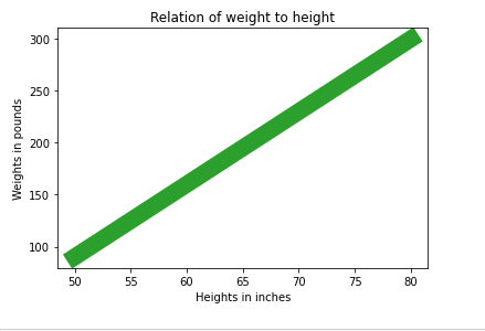
Creating subplots in pyplot
We can draw more than one plot in the same figure. The subplot() function takes in three arguments describing the figure's layout.
For instance, in the code below, the figure will have 1 row and 2 columns described by the first and second arguments in the subplot() function. The figure's third argument that we pass in the function represents the plot number.
x = np.linspace(0,4*np.pi,20)
y = np.sin(x)

plt.subplot(1, 2, 1)
plt.plot(x, y, ls='-.', c='tab:green')
plt.ylabel('sin x')
plt.xlabel('x')

z = np.cos(x)

plt.subplot(1, 2, 2)
plt.plot(x, z, ls='-', c='y')
plt.ylabel('cos x')
plt.xlabel('x')

plt.tight_layout()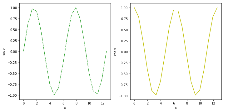
You can create any number of plots in the same figure and with different layouts; you only need to specify the number of rows and columns you want to plot. Let's create a figure with 2 rows and 2 columns:
X = np.linspace(0,4*np.pi,20)
ypoints1 = np.sin(X)

plt.figure(figsize= (10, 7))

plt.subplot(2, 2, 1) # plot 1
plt.plot(X, ypoints1, ls='--', c='tab:green')
plt.ylabel('sin x')
plt.xlabel('X values')

ypoints2 = np.cos(X)

plt.subplot(2, 2, 2) # plot 2
plt.plot(X, ypoints2, ls='-.', c='y')
plt.ylabel('cos x')
plt.xlabel('X values')

ypoints3 = np.square(X)

plt.subplot(2, 2, 3) # plot 3
plt.plot(X, ypoints3, ls='-', c='r')
plt.ylabel('X squared values')
plt.xlabel('X values')

ypoints4 = X**3

plt.subplot(2, 2, 4) # plot 4
plt.plot(X, ypoints4, ls=':', c=(0.3, 0.4, 0.7, 0.8))
plt.ylabel('X cubed values')
plt.xlabel('X values')

plt.suptitle('Multiple plots')

plt.tight_layout()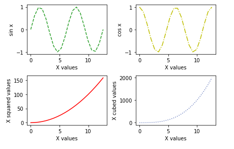
We can specify the title for each plot with the title() function or give a general title for the entire figure using suptitle() function.
... # in the code above include:

plt.suptitle('Multiple plots')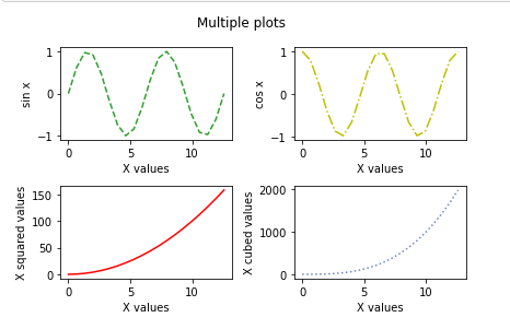
Since the plots look squeezed in the figure, we can give the figure width and height properties using the plt.figure() function.
... # in the code include:

plt.figure(figsize=(10, 7)) # figsize takes a tuple of with width and height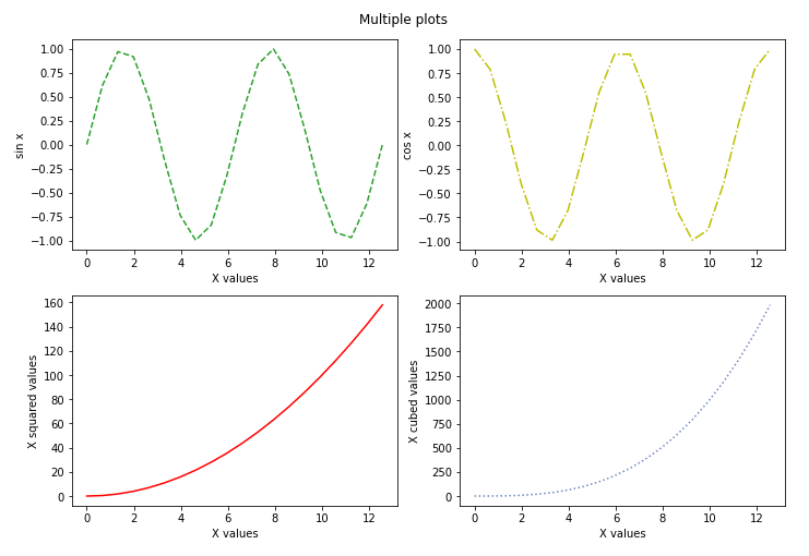
The downsides of the subplot() method for creating subplots are:
- It doesn't create multiple subplots at the same time.
- It deletes the previous plot of the figure.
In the Object-Oriented interface, we'll cover better methods like fig.subplots() to create the subplots.
Matplotlib markers
We set a marker for each point in the plotted line using the marker keyword and assigning it the type of marker we want. For example, below, we have star markers:
x = np.linspace(0,4*np.pi,20)
y = np.sin(x)
plt.plot(x, y, ls='-.', c='tab:green', marker='*') # star marker
plt.show() 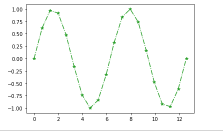
There are many types of markers we can use. Let's have a look at a few of them in the table below:
| Marker | Description |
|---|---|
| '*' | star marker |
| 'o' | circle |
| 'v' | triangle-down |
| '^' | triangle-up |
| '<' | triangle-left |
| '>' | triangle-right |
| 's' | square |
| '+' | plus |
| 'D', 'd' | thick and thin diamonds respectively |
| more markers |
Setting marker sizes and color
The marker size can be set with markersize or mskeyword.
markeredgecolor or mec keyword sets the edge color of the marker.
The color inside the marker is set with markerfacecolor or mfc keyword.
x = np.linspace(0,4*np.pi,20)
ypoints1 = np.sin(x)

plt.figure(figsize= (10, 7))

plt.subplot(2, 2, 1)
plt.plot(x, ypoints1, ls='--', c='k', marker='o', ms='15')
plt.title('markersize(ms)')

ypoints2 = np.cos(x)

plt.subplot(2, 2, 2)
plt.plot(x, ypoints2, ls='-.', c='k', marker='o', ms='15', mec='r')
plt.title('markeredgecolor(mec)-red')

ypoints3 = np.arccos(ypoints2)

plt.subplot(2, 2, 3)
plt.plot(x, ypoints3, ls='-', c='k', marker='o', ms='15', mec='r', mfc='hotpink')
plt.title('markerfacecolor(mfc)-color inside marker-hotpink')
plt.tight_layout()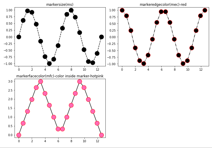
Setting Legends with pyplot
We include legends in a graph to describe the data elements represented on the y-axis. A legend is created with plt.legend() function in which we can specify various arguments. The following arguments are the basic ones we shall use:
- A list of artists to be included (handles)
- Location of the legend (loc)
- Coordinates of the legend (bbox_to_anchor)
- The font size of the legend (font size)
- Number of columns (ncols)
plt.legend(['name1', 'name2', 'nameN'], loc, bbox_to_anchor=(x,y), fontsize, ncols=1)Example:
x = np.linspace(0,4*np.pi,50)
ypoints1 = np.sin(x)
ypoints2 = np.cos(x)
ypoints3 = np.arccos(ypoints2)

plt.plot(x, ypoints1, x, ypoints2, x, ypoints3)

plt.legend(['sin x', 'cos x', 'arccos x'], loc='best', ncol=1, fontsize=15)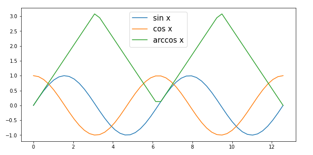
The location argument(loc) can have various values. We assign loc values as a string or numerical codes.
| loc string | code |
|---|---|
| 'best'(Automatically chooses best loc for the legend) | 0 |
| 'upper right' | 1 |
| 'upper left' | 2 |
| 'lower left' | 3 |
| 'lower right' | 4 |
| 'right' | 5 |
| 'center left' | 6 |
| 'center right' | 7 |
| 'lower center' | 8 |
| 'center right' | 7 |
| 'upper center' | 8 |
| 'center' | 9 |
pyplot and object-oriented approaches
Before we introduce the Object Oriented plotting interface(OO), let's internalize how we interacted with the pyplot module and what we expect from using OO to plot.
To use the pyplot module, we imported it from Matplotlib and assigned it an alias name plt. The module makes it very easy to generate plots while hiding the fact that Matplotlib is a hierarchy of nested Python objects.
The functions we have used like plt.plot(), plt.title(), plt.xlabel() implicitly keep track of the current figure, the plotting area, and the current Axes. pyplot preserves this state so that we have only one Figure or Axes that we are manipulating at a time, and we don't need to refer to it.
In the Object-Oriented approach, we will modify objects explicitly by calling the methods of an Axes object e.g. ax.set_title(), ax.set_xlabel() and ax.plot(). Most of the pyplot functions are defined in the matplolib.axes.Axes class.
Object Oriented plotting Interface (OO)
The main idea of using this interface is to create Figure objects and call methods off of that object. We will use pyplot only when creating Figure and Axes objects.
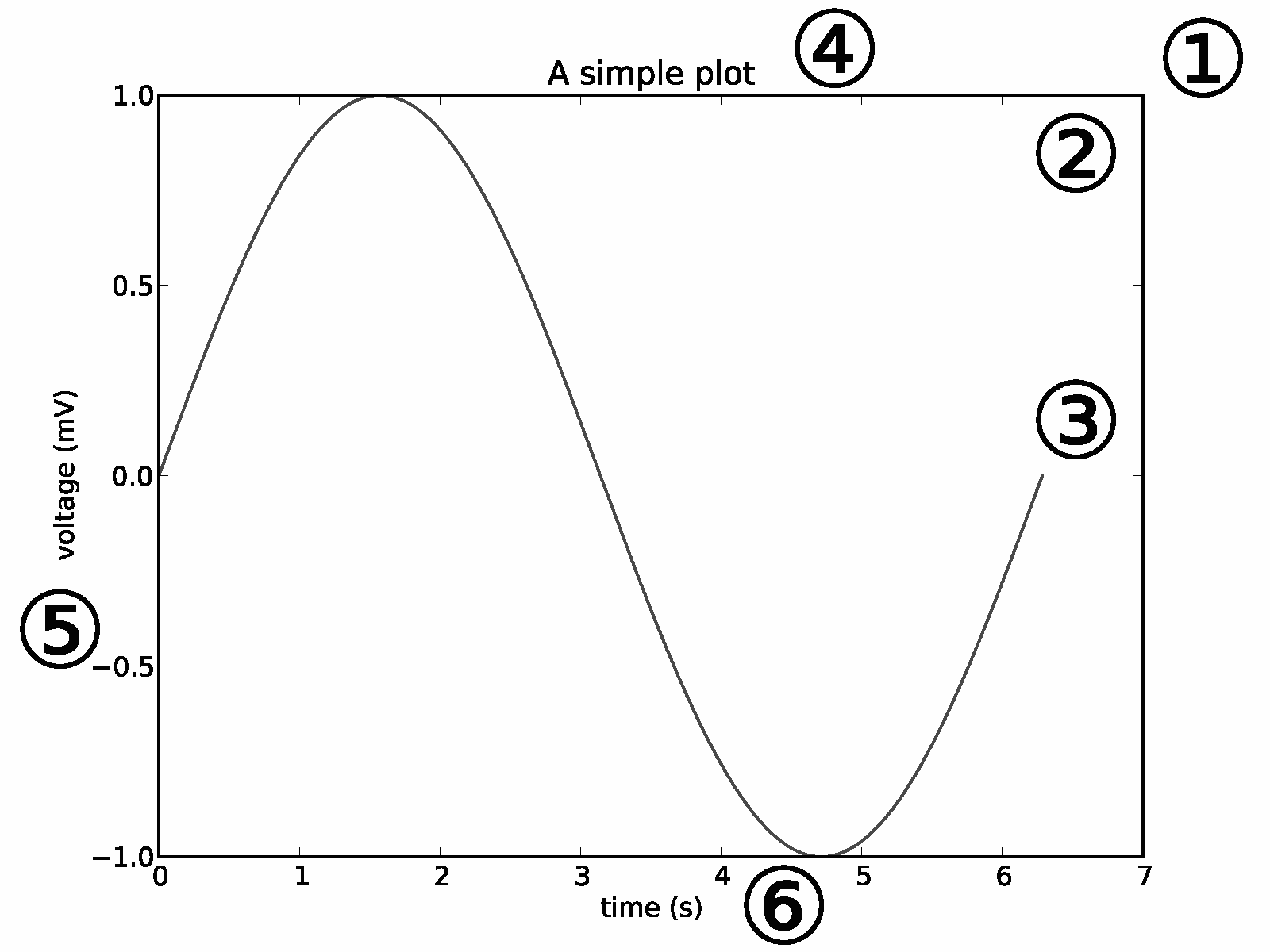
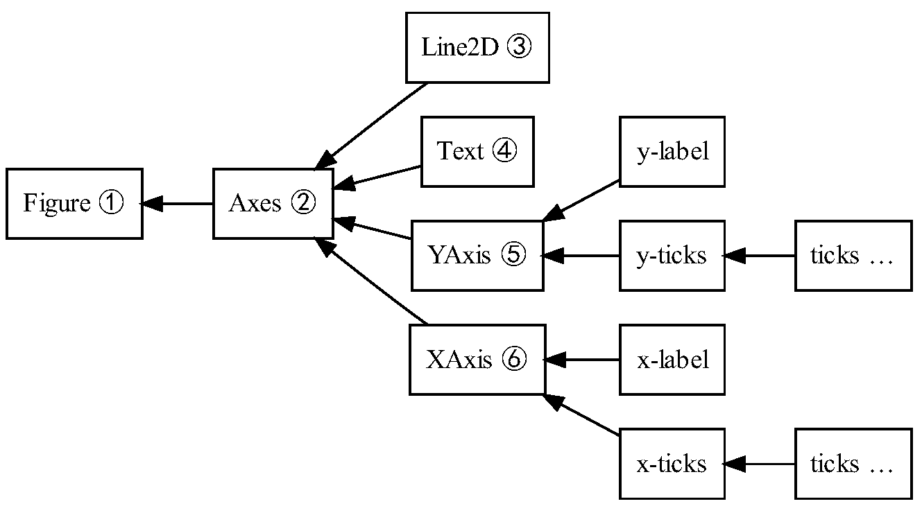
Parts of a Figure object
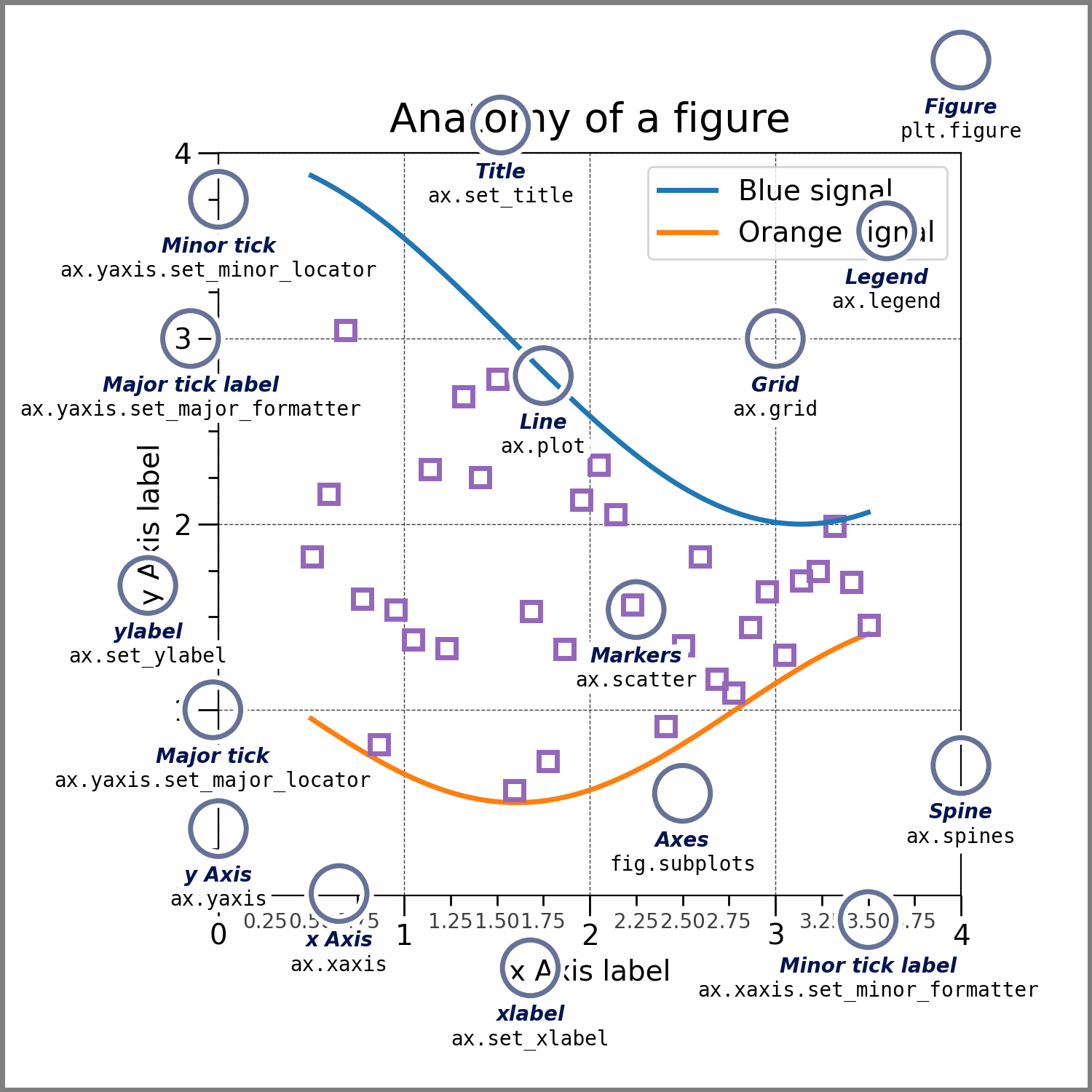
Things to note from the figure:
- The
Figureis the entire figure, which contains the legends, title, labels, etc. A figure can have manyAxes. - Each plot in the figure is an
Axesobject and contains the data we want to display.Axescan only belong to a single figure. - The
Axisobject sets the scale and limits and generates the marks on the axis. - Everything visible in the figure is a
Artist.
While we used the pyplot module to implicitly create and keep track of the current Figure and Axes object, in the OO approach, we will explicitly generate and keep track of the Figure and Axes objects ourselves.
Figure class
The matplotlib.figure module contains the Figure class. We create the Figure object by calling the figure() function from the pyplot module.
By instantiating the figure, we create an empty canvas that simulates a paper we can draw on. Instantiating this object is the only time we make use of the pyplot module in OO:
# instantiating a figure object

fig = plt.figure()
The syntax of the class is:
class matplotlib.figure.Figure(
			figsize=None,
			dpi=None,
            facecolor=None,
            edgecolor=None,
            linewidth=0.0,
            tight_layout=None,
            subplotpars=None
)figsizespecifies the dimensions of the figure – width and heightdpigives the dots per inch or the number of pixels per inch in the figure. The default dpi value forFigureobject is 100.facecoloris the figure patch color.edgecoloris the color of the figure's edges. The color can be assigned as we specified in Matplotlib color formats.linewidthis the width of the figure's edge. Its color is theedgecolorvalue.tight_layoutadjust the padding between and around subplots. Some platforms may work withtight_layout=Trueand otherslayout='tight. We use it to make subplots fit in the figure when the axis labels or titles overlap. You can also specify it asplt.tight_layout.subplotparsspecify the subplot parameters.
Example:
import math
x = np.arange(0, math.pi*5, 0.05)
y = np.sin(x)

fig = plt.figure(figsize=(8, 5), facecolor='y', edgecolor='tab:pink', linewidth=20) # creating the figure object

ax = fig.add_axes([0, 0, 1, 1]) # add an axes

ax.plot(x, y)
Axes class
The Axes class forms the primary working of the OO interface. It makes it possible to create subplots. We add an Axes object to a figure by calling the add_axes() method. Many Axes objects can be created on a Figure.
We use the syntax:
ax=fig.add_axes([left, bottom, width, height])The [left, bottom, width, height] gives the dimensions of the new Axes, and each value ranges from 0 to 1. The 'ax' variable can be any name you choose, but we recommend that you use 'ax' to create the Axes instance.
Example:
import math
# plot multiple axes in the same axes object

x = np.arange(0, math.pi*5, 0.05)
y = np.sin(x)
z = np.cos(x)

fig = plt.figure(figsize=(8, 5)) # creating the figure object

# adding an axes
ax = fig.add_axes([1, 1, 1, 1]) # [length, bottom, width, height]

ax1 = ax.plot(x, y, c='tab:green')
ax2 = ax.plot(x, z, c='tab:red')
Adding Labels, titles, and legends
Like in pyplot, the Axes class has methods we can use to format the look of the plots. Unlike in pyplot, the labels and titles are added with setter methods.
Let's add some labels, titles, and a legend to the figure:
import math
x = np.arange(0, math.pi*5, 0.05)
y = np.sin(x)
z = np.cos(x)

fig = plt.figure(figsize=(8, 5)) # creating the figure object

ax = fig.add_axes([1, 1, 1, 1]) # adding an axes

ax1 = ax.plot(x, y, c='tab:green')
ax2 = ax.plot(x, z, c='tab:red')

# setting the title of the figure
ax.set_title('sin and cos x')

# setting x and y labels and giving color and fontsize
ax.set_xlabel('X-Axis', c='b', fontsize='xx-large')
ax.set_ylabel('Y-Axis', c='c', fontsize='xx-large')

# setting Legends
ax.legend(['SIN X', 'COS X'], loc='upper right', bbox_to_anchor=(0.72, 1), fontsize='medium')
plt.show()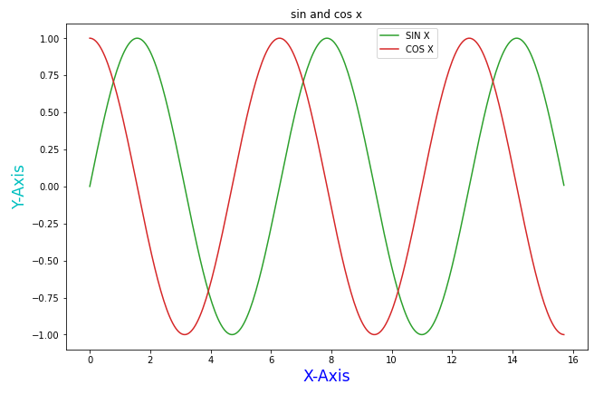
You can revisit how to position the legend as we specified in Legend location values.
Creating subplots or Multi plots in OO
There are three methods we can use to create subplots with the Object-Oriented approach:
- By adding Axes to the figure with the
add_axes()method. - Using
subplots()method. - Using a more flexible method called
subplot2grid().
Creating subplots with add_axes()
We can add as many Axes as we want with the add_axes() method. Let's see how:
months = np.array(['Jan', 'Feb', 'March', 'April', 'May', 'Jun'])
savings = np.array([8500, 14700, 12850, 13900, 23650, 15500])
expenses = np.array([1500, 1200, 1000, 500, 2500, 3000, 700])
days = np.array(['Mon', 'Tue', 'Wed', 'Thu', 'Fri', 'Sat', 'Sun'])


# Instantiate figure
fig = plt.figure(figsize=(5, 4), facecolor='pink', edgecolor='y', linewidth=10)
# Add first axes
ax1 = fig.add_axes([0, 0.1, 0.8, 0.8])
ax1.set_title('Monthly savings', fontsize=15)
ax1.set_xlabel('Months', fontsize=15)
ax1.set_ylabel('Savings', fontsize=15)
# Add second axes
ax2 = fig.add_axes([1, 0.1, 0.8, 0.8])

ax2.set_title('Average Day expenses', fontsize=15)
ax2.set_xlabel('Days', fontsize=15)
ax2.set_ylabel('expenses', fontsize=15)

# plot data
ax1.plot(months, savings, c='r')
ax2.plot(days, expenses, c='green')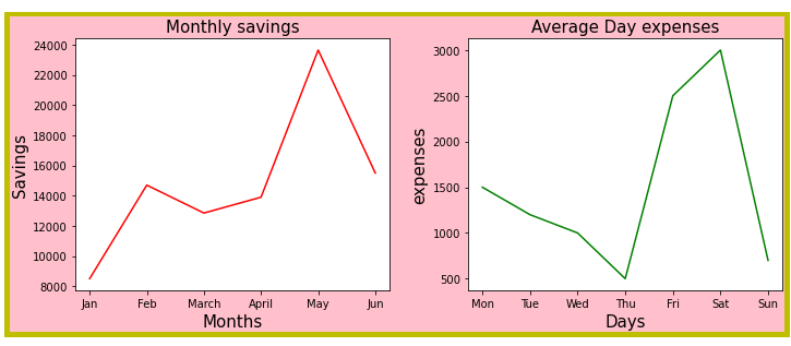
We have given the figure a facecolor of pink and a border. To show that we have complete control of where we want the Axes placed in the figure, unlike in pyplot, we can illustrate this more by even making an inset Axes to the same figure:
months = np.array(['Jan', 'Feb', 'March', 'April', 'May', 'Jun'])
savings = np.array([8500, 14700, 12850, 13900, 23650, 15500])
expenses = np.array([1500, 1200, 1000, 500, 2500, 3000, 700])
days = np.array(['Mon', 'Tue', 'Wed', 'Thu', 'Fri', 'Sat', 'Sun'])


# Instantiate figure
fig = plt.figure(figsize=(7, 4), facecolor='pink', edgecolor='y', linewidth=5)
# Add first axes
ax1 = fig.add_axes([0.1, 0.1, 0.8, 0.8])
ax1.set_title('Monthly savings', fontsize=15)
ax1.set_xlabel('Months', fontsize=15)
ax1.set_ylabel('Savings', fontsize=15)
# Add second axes
ax2 = fig.add_axes([0.25, 0.5, 0.3, 0.3]) # the inset Axes

ax2.set_title('Average Day expenses')
ax2.set_xlabel('Days')
ax2.set_ylabel('expenses')
ax2.grid(color='b', ls = '-.', lw = 0.15) # setting grids

# plot data
ax1.plot(months, savings, c='r')
ax2.plot(days, expenses, c='green')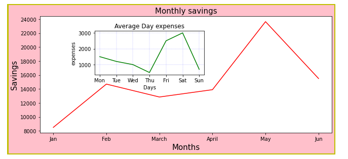
Creating subplots with subplots() method
The subplots() method acts as a utility wrapper, making it more convenient for creating figures and multiple subplots simultaneously. It has the syntax:
matplotlib.pyplot.subplots(
		nrows=1,
        ncols=1,
        sharex=False,
        sharey=False,
        squeeze=True,
        subplot_kw=None,
        gridspec_kw=None,
**fig_kw)nrowsandncolsrepresent the subplot grid's number of rows and columns.sharex(share x-axis)andsharey(share y-axis) control the sharing of the x and y-axis. Note that when subplots have a shared x-axis along a column, only the x-tick labels of the bottom subplot are created. When subplots have a shared y-axis along a row, only the y tick labels of the first column subplot are created.
Let's now see how it's done:
fig, ax = plt.subplots()

# NOTES
# fig returns a figure object
# ax returns a list of Axes objects equal to nrows*ncols.
# Each Axes object is accessible by its index.
We use the tuple unpacking concept to get the axes.
fig, ax = plt.subplots(2, 2)

#fig is the Figure Object - canvas
print(type(fig))

#ax is a list of Axes Objects of nrows*ncols
for x in ax:
    print(x)

'''
<class 'matplotlib.figure.Figure'>
[<AxesSubplot:> <AxesSubplot:>]
[<AxesSubplot:> <AxesSubplot:>]
'''
Example 1:
months = np.array(['Jan', 'Feb', 'March', 'April', 'May', 'Jun'])
savings = np.array([8500, 14700, 12850, 13900, 23650, 15500])
expenses = np.array([1500, 1200, 1000, 500, 2500, 3000, 700])
days = np.array(['Mon', 'Tue', 'Wed', 'Thu', 'Fri', 'Sat', 'Sun'])

fig, ax = plt.subplots(1, 2, figsize=(10,5), facecolor='c', edgecolor='y', linewidth=5, layout='tight')

# ax is a 1D array

ax[0].plot(months, savings, c='r') # plot on first axes

ax[0].set_title('Monthly savings', fontsize=15)
ax[0].set_xlabel('Months', fontsize=15)
ax[0].set_ylabel('Savings', fontsize=15)

ax[1].plot(days, expenses, c='g') # plot on second axes
ax[1].set_title('Average Day expenses', fontsize=15)
ax[1].set_xlabel('Days', fontsize=15)
ax[1].set_ylabel('expenses', fontsize=15)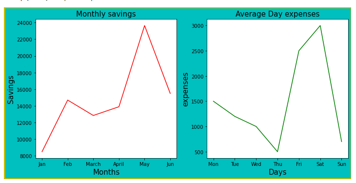
Example 2:
X = np.linspace(0,4*np.pi,20)
ypoints1 = np.sin(X)
ypoints2 = np.cos(X)
ypoints3 = np.square(X)
ypoints4 = X**3

fig, ax = plt.subplots(2, 2, figsize=(10,7), layout='tight')

# ax is a 2D array

ax[0][0].plot(X, ypoints1, c='r')
ax[0][0].set_title('sin X')
ax[0][0].set_xlabel('X values')
ax[0][0].set_ylabel('Sin X values')

ax[0][1].plot(X, ypoints2, c='tab:cyan')
ax[0][1].set_title('cos X')
ax[0][1].set_xlabel('X values')
ax[0][1].set_ylabel('cos X values')

ax[1][0].plot(X, ypoints3, c='green')
ax[1][0].set_title('X squared')
ax[1][0].set_xlabel('X values')
ax[1][0].set_ylabel('X squared values')

ax[1][1].plot(X, ypoints4, 'm')
ax[1][1].set_title('X cubed')
ax[1][1].set_xlabel('X values')
ax[1][1].set_ylabel('X cubed values')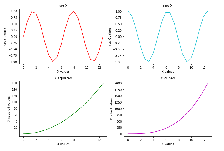
Creating subplots with subplot2grid() method
This method has more flexibility as it allows the creation of Axes objects at a specified location in a grid. It also enables the axes to objects to be spanned across multiple rows or columns. Its syntax is:
matplotlib.pyplot.subplot2grid(shape, loc, rowspan=1, colspan=1)

#calling
ax = subplot2grid((nrows, ncols), (row, col), rowspan, colspan)- shape is a tuple with the number of rows and columns of the grid where the axis is placed.
- loc represents the row and column number of the axis location within the grid.
- rowspan and colspan each represent the number of rows and columns for the axis to span, respectively.
Example:
X = np.linspace(0,4*np.pi,20)
ypoints1 = np.sin(X)
ypoints2 = np.cos(X)
ypoints3 = np.square(X)
ypoints4 = X**3

fig = plt.figure(figsize=(9, 5), layout='tight')

#creating axes
ax1 = plt.subplot2grid((3, 3), (0, 0), colspan=3)
ax2 = plt.subplot2grid((3, 3), (1, 0), colspan=2)
ax3 = plt.subplot2grid((3, 3), (1, 2), rowspan=2)
ax4 = plt.subplot2grid((3, 3), (2, 0))
# plotting
ax1.plot(X, ypoints1, c='r')
ax1.set_title('sin X')
ax1.set_xlabel('X values')
ax1.set_ylabel('Sin X values')

ax2.plot(X, ypoints2, c='tab:cyan')
ax2.set_title('cos X')
ax2.set_xlabel('X values')
ax2.set_ylabel('cos X values')

ax3.plot(X, ypoints3, c='green')
ax3.set_title('X squared')
ax3.set_xlabel('X values')
ax3.set_ylabel('X squared values')

ax4.plot(X, ypoints4, 'm')
ax4.set_title('X cubed')
ax4.set_xlabel('X values')
ax4.set_ylabel('X cubed values')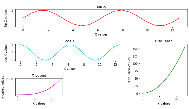
Setting the X and Y limits and tick labels
The Axes class provides methods to modify the limits for the x and y-axis. As you have noticed so far, matplotlib automatically sets those limits depending on the points we give.
X and Y limits
The X-limits are set with ax.set_xlim(). Syntax:
Axes.set_xlim(self, left=None, right=None, emit=True)- left is the left xlim in data coordinates.
- right is the right xlim in data coordinates
- emit is used to notify observers of limit change.
The Y-limits are set with ax.set_ylim(). Syntax:
Axes.set_xlim(self, bottom=None, top=None, emit=True)- bottom is the bottom ylim in data coordinates.
- top is the top ylim in data coordinates.
- emit notifies the observers of limit change.
Example:
X = np.linspace(0,4*np.pi,20)
y = np.square(X)

fig, ax = plt.subplots(1, 2, figsize=(8,5), layout='tight')

ax[0].plot(y, c='r')
ax[0].set_title('Original limits')
ax[0].set_xlabel('X values')
ax[0].set_ylabel('Sin X values')

ax[1].plot(y, c='g')
ax[1].set_title('Set limits')
ax[1].set_xlabel('X values')
ax[1].set_ylabel('Sin X values')

# setting limits
ax[1].set_ylim(0, 120)
ax[1].set_xlim(0, 10)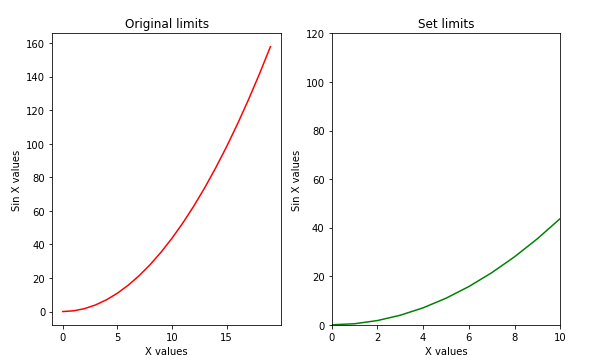
Tick labels
Ticks mark a position or data points on an Axis. They have markers and labels which we can modify.
We give a list parameter to xticks() and yticks() functions with position values to where we want the ticks shown.
The ax.set_xticklabels() for the x-axis and ax.set_xticklables() for the y-axis will give the labels.
X and Y tick labels syntaxes:
Axes.set_xticklabels(self, labels, fontdict=None, minor=False, **kwargs)

Axes.set_yticklabels(self, labels, fontdict=None, minor=False, **kwargs)
X = np.linspace(0,4*np.pi,20)
y = np.square(X)
fig, ax = plt.subplots(1, 2, figsize=(8,3), layout='tight')
ax[0].plot(y, c='r')
ax[0].set_title('Original')
ax[0].set_xlabel('X values')
ax[0].set_ylabel('Sin X values')
ax[1].plot(y, c='g')
ax[1].set_title('Set X tick labels')
ax[1].set_xlabel('X values')
ax[1].set_ylabel('Sin X values')
# setting limits
ax[1].set_ylim(0, 120)
ax[1].set_xlim(0, 10)
# set labels
ax[1].set_xticks([0, 2, 4, 6, 8, 10]) # specify tick positions
ax[1].set_xticklabels(['zero','two','four','six', 'eight', 'ten'])
plt.show()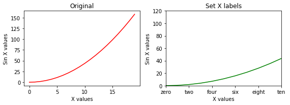
Adding grid lines to a figure
Matplotlib's Axes object has a grid()function that we can call to the set visibility of grid lines on or off. We can style the lines with colors, linestyles, linewidth, etc.
X = np.linspace(0,4*np.pi,20)
y = np.square(X)

fig, ax = plt.subplots()

ax.plot(y, c='r')
ax.set_title('sin X')
ax.set_xlabel('X values')
ax.set_ylabel('Sin X values')
ax.grid(c='g', ls=':', lw=1.2 )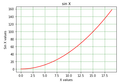
Twin Axes
Sometimes we can have a dual X or Y Axis in a figure. That is, we can create twin Axes sharing the same axis. The autoscale setting is inherited from the original Axes to ensure that the tick marks of both y-Axes align. The function Axes.twinx() does this for us:
X = np.linspace(0,4*np.pi,20)
y = np.sin(X)
z = np.cos(X)

fig, ax = plt.subplots(figsize=(5, 2), dpi=100)

ax.plot(X, y, c='r')
ax.set_xlabel('X values')
ax.set_ylabel('Sin X values')

ax2 = ax.twinx() # setting the twin axes

ax2.plot(X, z, c='purple')
ax2.set_ylabel('cos X values')

ax.grid(c='g', ls=':')
fig.legend(['sin X', 'cos X'], loc='upper right', bbox_to_anchor=(0.81, 0.87), fontsize=8)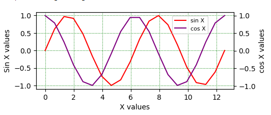
Types of plots in Matplotlib
At this point, it's most likely that you are "bored" working with only one-line graphs. In this section, we'll explore some other different plots we can create with Maptlotlib.
Bar charts
These graphs show comparisons between discrete data categories by representing the data in rectangular bars. The bars have heights and widths proportional to the values they are presenting.
Matplotlib provides bar() method which can be used in pyplot's style plt.bar() or OO style ax.bar().
The syntax for a verticle bar is:
Axes.bar(x, height, width=0.8, bottom=None, *, align='center')- x represents the coordinates of the bars.
- height and weight represent the heights and widths of the bars. The default width is 0.8.
- bottom is the y coordinates of the bars.
- align gives the alignment of the bars to the x coordinates. Default alignment is 'center.'
days = np.array(['Mon', 'Tue', 'Wed', 'Thu', 'Fri', 'Sat', 'Sun'])
expenses = np.array([1500, 1200, 1000, 500, 2500, 3000, 700])

fig, ax = plt.subplots(figsize=(10, 4), facecolor=(0.5, 0.5, 0.4, 0.2))

ax.bar(days, expenses, color='m')
ax.set_title('Average Day expenses')
ax.set_xlabel('Days')
ax.set_ylabel('expenses')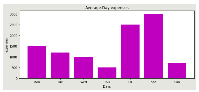
Horizontal bar (barh)
A horizontal bar is created with the barh() method. Syntax:
Axes.barh(y, width, height=0.8, left=None, *, align='center')- y represents the y coordinates of the bar.
days = np.array(['Mon', 'Tue', 'Wed', 'Thu', 'Fri', 'Sat', 'Sun'])
expenses = np.array([1500, 1200, 1000, 500, 2500, 3000, 700])

fig, ax = plt.subplots(figsize=(10, 4), facecolor=(0.5, 0.5, 0.4, 0.2))

ax.barh(days, expenses, color='m')
ax.set_title('Average Day expenses')
ax.set_xlabel('Expenses')
ax.set_ylabel('Days')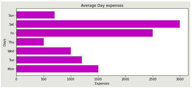
Remember to adjust the labels and ticks when plotting the horizontal bar.
Stacked bar graph
These graphs represent different groups on top of each other. The height of the bar is the combined results of the groups.
Tip: We use the optional bottom parameter of the bar() function to specify a starting value for a bar. Instead of running from zero to a value, it will go from the bottom to the value.
x = np.array(['Mon', 'Tue', 'Wed', 'Thu', 'Fri'])
c1 = np.array([6000, 4000, 3500, 2000, 5000])
c2 = np.array([3000, 2500, 4500, 6000, 4500])
c3 = np.array([2500, 6000, 3500, 1500, 3000])
c4 = np.array([7200, 3600, 3400, 5500, 2400])

fig, ax = plt.subplots(figsize=(8, 5), facecolor=(0.5, 0.5, 0.4, 0.2))

ax.bar(x, c1, color='r')
ax.bar(x, c2, bottom=c1, color='g')
ax.bar(x, c3, bottom= c1+c2, color='c')
ax.bar(x, c4, bottom= c1+c2+c3, color='b')

ax.set_title('Day profit from different companies')
ax.set_ylabel('Profis')
ax.set_xlabel('Days')
ax.legend(['Co.1', 'Co.2', 'Co.3', 'Co.4'], loc='best')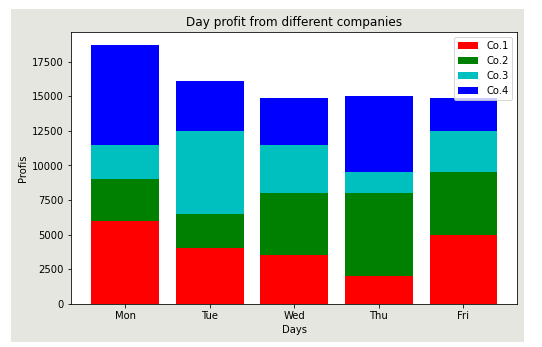
Histogram
This is a kind of bar graph where bin ranges are represented on the x-axis, and the y-axis shows the frequency. The hist() function creates the histogram.
x = np.array([3000, 400, 500, 6000, 4000, 2500, 6000, 3800, 1500, 3000 ])

fig, ax = plt.subplots()

ax.hist(x, bins=[0, 1500, 2000, 3000, 4000, 5000, 6000]) # made number of bins as a list (6 Bins)
ax.set_title('Histogram')
ax.set_ylabel('Frequency')
ax.set_xlabel('Values')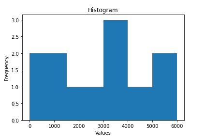
Pie plots
A pie plot is a circular chart that displays only one data series. Data points in pie charts are shown as a percentage of the entire pie, and each slice in the pie is called a wedge.
Syntax:
matplotlib.pyplot.pie(data, explode=None, labels=None, colors=None, autopct=None, shadow=False)- data is an array sequence of wedge sizes.
- explode parameter moves a wedge off the pie.
- labels are the labels for each wedge.
- autopct labels the wedge with its numerical value.
- shadow creates a shadow of the wedge.
days = np.array(['Mon', 'Tue', 'Wed', 'Thu', 'Fri', 'Sat', 'Sun'])
data = np.array([1500, 1200, 1000, 500, 2500, 3000, 700])

fig, ax = plt.subplots(figsize=(10, 4))

explode = [0.1, 0.5, 0, 0, 0, 0, 0]

ax.pie(data, labels=days, explode=explode, autopct='%1.2f%%', shadow=True)
plt.show()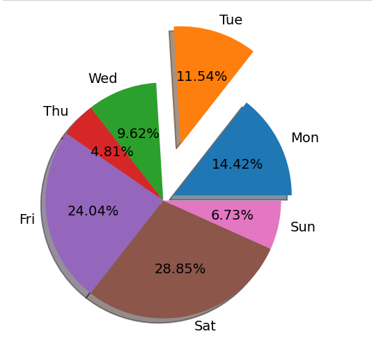
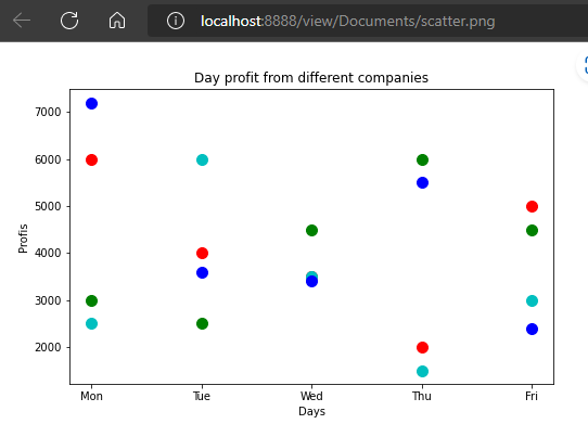
Scatter plots
These plots display the relationship between variables.
Syntax:
matplotlib.pyplot.scatter(x, y, s=None, c=None, marker=None, cmap=None, vmin=None, vmax=None, alpha=None, linewidths=None, edgecolors=None- x and y represent data positions.
- s is the marker size value.
- marker is the marker style.
- c specifies the color sequence of markers.
- edgecolor gives the marker border color.
- alpha sets the transparency value between 0 and 1.
x = np.array(['Mon', 'Tue', 'Wed', 'Thu', 'Fri'])
c1 = np.array([6000, 4000, 3500, 2000, 5000])
c2 = np.array([3000, 2500, 4500, 6000, 4500])
c3 = np.array([2500, 6000, 3500, 1500, 3000])
c4 = np.array([7200, 3600, 3400, 5500, 2400])

fig, ax = plt.subplots(figsize=(8, 5))

ax.scatter(x, c1, color='r', s=100)
ax.scatter(x, c2, color='g', s=100)
ax.scatter(x, c3, color='c', s=100)
ax.scatter(x, c4, color='b', s=100)

ax.set_title('Day profit from different companies')
ax.set_ylabel('Profis')
ax.set_xlabel('Days')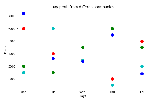
Saving a Matplotlib figure
A figure can be saved in a storage drive in many formats like .png, .jpg, .pdf, .svg, etc.
This is done using the savefig() function. Syntax:
savefig(fname, *, dpi='figure', format=None, metadata=None,
        bbox_inches=None, pad_inches=0.1,
        facecolor='auto', edgecolor='auto',
        backend=None, **kwargs
)- format specifies the format you want to save as.
- pad_inches gives the amount of padding around the figure.
x = np.array(['Mon', 'Tue', 'Wed', 'Thu', 'Fri'])
c1 = np.array([6000, 4000, 3500, 2000, 5000])
c2 = np.array([3000, 2500, 4500, 6000, 4500])
c3 = np.array([2500, 6000, 3500, 1500, 3000])
c4 = np.array([7200, 3600, 3400, 5500, 2400])

fig, ax = plt.subplots(figsize=(8, 5))

ax.scatter(x, c1, color='r', s=100)
ax.scatter(x, c2, color='g', s=100)
ax.scatter(x, c3, color='c', s=100)
ax.scatter(x, c4, color='b', s=100)

ax.set_title('Day profit from different companies')
ax.set_ylabel('Profis')
ax.set_xlabel('Days')

# saving figure
plt.savefig('scatter.png')
Final thoughts
We have discussed Matplotlib concepts fundamental to building visualizations for your datasets in detail. We have covered:
- Visualizing data with
matplotlib.pyplotmodule. We have learned that thepyplotmodule is state-based, and we have little control of our plots while using it, especially when we have multiple complex plots. - Visualizing data with the Object-Oriented interface where we defined Figure objects and Axes by ourselves.
- Matplotlib's plot types.
- Several
pyplotand Matplotlib object-oriented concepts.
It is also essential that you get used to plotting with the OO plotting interface as it provides more flexibility over your plots. Let's get plotting!
The Complete Data Science and Machine Learning Bootcamp on Udemy is a great next step if you want to keep exploring the data science and machine learning field.
Follow us on LinkedIn, Twitter, GitHub, and subscribe to our blog, so you don't miss a new issue.