
Seaborn tutorial


Seaborn is a simple, easier-to-learn open-source data visualization Python library that provides fantastic default styles and color palettes to create attractive and informative statistical plots. Seaborn is built on top of Matplotlib. Matplotlib treats Figures and Axes as objects and focuses on how to draw them. Seaborn has a dataset-oriented, declarative API that lets you treat a whole dataset as a single unit and focus on what elements in your plots mean than how to draw them.
Seaborn's plotting functions leverage the help of Matplotlib, Numpy arrays, and Pandas DataFrames. The table below shows the differences between Seaborn and Matplotlib:
| Features | Matplotlib | Seaborn |
|---|---|---|
| Functionality | Mainly used for basic plots consisting of bars, pies, scatter, and line plots | Provides a variety of visualizations patterns, and is mainly for statistics visualization |
| Syntax | Has complex and lengthy syntax | Has simple and easy-to-learn syntax |
| Visualization | Works well with Numpy and Pandas | Works well with Pandas DataFrames |
| Flexibility | It's robust and highly customizable | Has default themes to avoid a ton of boilerplate |
| Handling multiple figures | Can open multiple figures at the same time which need to be closed explicitly with pyplot.close() or plt.close('all') |
Sets a time limit for the creation of each figure |
| Arrays and Data Frames | Works with arrays and DataFrames. Has stateful and stateless APIs for plotting Figures and Axes | Treats the dataset as a whole and not stateful like matplotlib |
Installing and getting started with Seaborn
If you have Python and pip installed, run pip install matplotlib from your terminal or cmd:
pip install seabornOn Anaconda prompt run:
conda install seabornGetting started
To begin with, we first need to import the Pandas library, which manages data in table formats or DataFrames:
import pandas as pdThen import Matplotlib, which enables us to customize our plots:
import matplotlib.pyplot as pltAnd finally, import Seaborn:
import seaborn as snsHow to load datasets to build Seaborn plots
We can work with two types of datasets in Seaborn. We can use Seaborn's built-in datasets or load our datasets as Pandas DataFrame.
Loading Seaborn's built-in datasets
Seaborn ships with a few example datasets when we install it. We can load these datasets and use them for learning. Use the code below to check the available datasets:
import seaborn as sns
print(sb.get_dataset_names())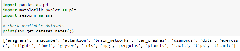
Use load_dataset() to load any of the datasets. The function returns a Pandas DataFrame:
df = sns.load_dataset('iris', index_col=0)

print('Type: ', type(df))
df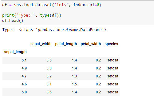
Load Pandas DataFrame
What else can make visualizing data more fun than working with our data and not the built-in data? Seaborn integrates well with Pandas DataFrames.
Read more on how to load various formats of data with Pandas.
Let's load and use the Students' data dataset from Kaggle. Here's is an overview of the data:
df = pd.read_csv('Students data.csv')
print('Shape:',df.shape)
df_head_tail= pd.concat([df.head(), df.tail()])
df_head_tail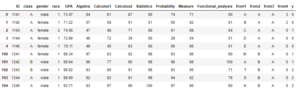
In this tutorial, we will use the Student scores dataset interchangeably with any of Seaborn's built-in datasets:
Before we proceed, let's build a simple Seaborn plot:
# Build a simple Seaborn plot
df = pd.read_csv('Students data.csv')
sns.lineplot(x='Algebra', y='GPA', data=df)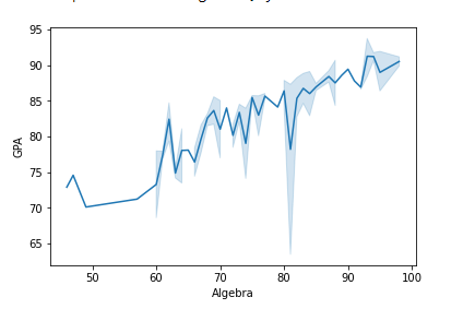
How to use Seaborn with Matplotlib
When plotting using Seaborn and Matplotlib, we run Seaborn's functions and then call the customization functions of Matplotlib.
For example, we can set the title, x, and y limits of a Seaborn plot with Matplotlib:
# Using Seaborn with Matplotlib
df = pd.read_csv('Students data.csv')
sns.lineplot(x='Algebra', y='GPA', data=df)
plt.xlim(50, 80)
plt.ylim(70, 90)
plt.title('Title and limits set with Matplotlib')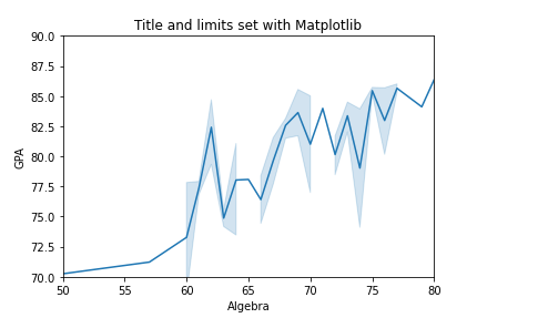
To refresh your Matplotlib knowledge, take a quick peek at our Data visualization with Matplotlib tutorial.
Configuring figure aesthetics
Visualizing data aims to get beneficial insights from huge data. Making these visuals attractive and pleasing can help achieve this goal as people tend to zero in on well-styled visualizations rather than 'dry' ones, which is why styling is so important.
Matplotlib is a highly customizable library, and one should be aware of the settings they need to make to enhance the attractiveness of its plots. Seaborn has customized themes and a high-level interface for styling and controlling the look of graphs which we can use to customize Matplotlib's plots easily. Seaborn provides a set_theme() method for these customizations.
In some places, you might see the set() method used instead of set_theme(). Well, set() is kind of an alias to set_theme() and might deprecate in the future. set_theme() is the preferred interface.
For instance, we had this Matplotlib plot:
import matplotlib.pyplot as plt
import numpy as np
import math

x = np.arange(0, math.pi*5, 0.05)
y = np.sin(x)
z = np.cos(x)
fig = plt.figure(figsize=(6, 4))
ax = fig.add_axes([1, 1, 1, 1])
ax1 = ax.plot(x, y, c='tab:green')
ax2 = ax.plot(x, z, c='tab:red')
ax.set_xlabel('X-Axis', c='b', fontsize='xx-large')
ax.set_ylabel('Y-Axis', c='c', fontsize='xx-large')
ax.legend(['SIN X', 'COS X'], loc='upper right', bbox_to_anchor=(0.72, 1), fontsize='medium')
plt.show()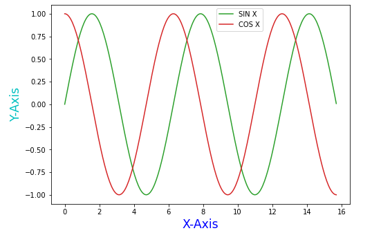
Let's change the above plot to Seaborn using the default theme:
import matplotlib.pyplot as plt
import numpy as np
import math

x = np.arange(0, math.pi*5, 0.05)
y = np.sin(x)
z = np.cos(x)
fig = plt.figure(figsize=(6, 4))
ax = fig.add_axes([1, 1, 1, 1])
ax1 = ax.plot(x, y, c='tab:green')
ax2 = ax.plot(x, z, c='tab:red')
ax.set_xlabel('X-Axis', c='b', fontsize='xx-large')
ax.set_ylabel('Y-Axis', c='c', fontsize='xx-large')
ax.legend(['SIN X', 'COS X'], loc='upper right', bbox_to_anchor=(0.72, 1), fontsize='medium')
plt.show()

import seaborn as sns
sns.set_theme() # calling the set_theme() method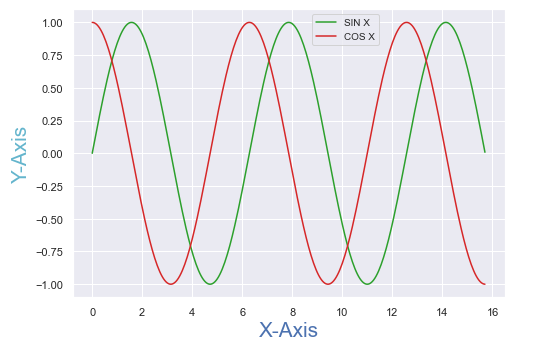
The plots are similar, but a slight difference in styling is visible.
Seaborn figure styles
Seaborn has five more themes that we can use to manipulate the styling. The set_style() method helps us set these themes. The themes are:
darkgrid: default.whitegrid: suited for plots with heavy data elements.dark: removes the grid to give impressions of patterns in data.whiteticks: gives a little extra structure to the plots.
For example:
- Setting the theme to
whitegrid:
# setting theme to white grid
df = pd.read_csv('Students data.csv')
sns.lineplot(x='Algebra', y='GPA', data=df)
sns.set_style('whitegrid')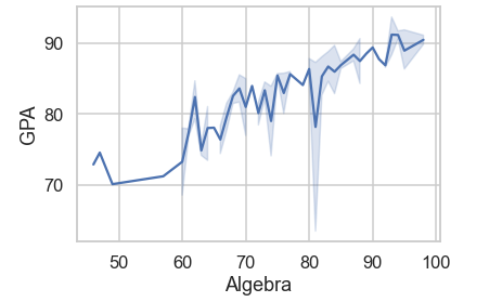
- Setting theme to
darkgrid:
# setting theme to dark grid
df = pd.read_csv('Students data.csv')
sns.lineplot(x='Algebra', y='GPA', data=df)
sns.set_style('darkgrid')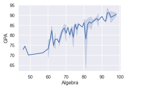
Removing axes spines
Spines are the lines connecting the axis tick marks and marking the boundary area. We don't need the top and right axes spines, especially on the white and ticks themes. We can use the Seaborn function despine() to remove them.
despine() syntax:
seaborn.despine(top=True, right=True, left=False, bottom=False, offset=None, trim=False)offset: absolute distance spines should be moved away from the axes.trim: limits the range of spines when ticks don't cover the whole range of the axis.
Example:
# removing spines
df = pd.read_csv('Students data.csv')
sns.lineplot(x='Algebra', y='GPA', data=df)
sns.set_style('white')
# removed top and right axis spines trim and offset
sns.despine(top=True, right=True, offset=5, trim=True)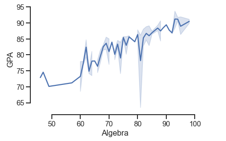
Setting figure style temporarily and overriding default styles
To change the plot style temporarily, we use the axes_style() method as a context manager. The method is used with the with statement.
# changing the style temporarily
df = pd.read_csv('Students data.csv')
with sns.axes_style('dark'):
    sns.lineplot(x='Algebra', y='GPA', data=df)
sns.despine(top=True, right=True, offset=5, trim=True) 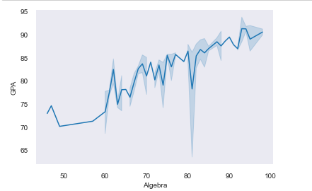
We can also use the axes_style() method to display the available parameters, which we pass as a dictionary to the set_style() function to override Seaborn's default parameter values.
Checking the parameters available:
print(sns.axes_style())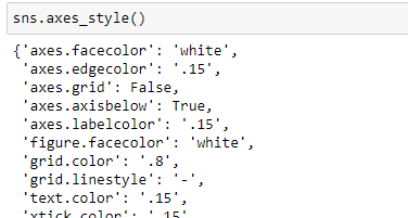
df = pd.read_csv('Students data.csv')
sns.lineplot(x='Algebra', y='GPA', data=df)
sns.set_style('darkgrid',
              {'figure.facecolor':'blue',
               'grid.color': 'red',
               'axes.spines.bottom': True,
               'ytick.direction': 'in',
               'grid.linestyle': ':',
               'axes.labelcolor': 'white',
                })
# sns.axes_style()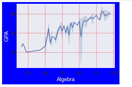
Scaling plots elements
The set_context() method sets parameters that control the plot's scaling. It does not affect the overall styling; only lines, labels, and other elements are changed.
Syntax:
seaborn.set_context(context=None, font_scale=1, rc=None)context: defines the name of the preset context.
There are four preset contexts, paper, notebook(default), talk, and poster.
font_scale: scales the size of the font elements.rc: dictionary with parameters to override preset seaborn context dictionaries.
To check the context dictionary parameter values used in rc:
print(sns.plotting_context)
Example:
df = pd.read_csv('Students data.csv')
sns.lineplot(x='Algebra', y='GPA', data=df)
sns.set_context('talk', font_scale=0.9)

# try also overriding
# sns.set_context('poster', rc='font.size': 15.0)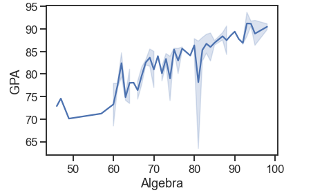
Seaborn Color Paletes
Seaborn provides an essential function for working with color palettes called color_palette(). It provides an interface for generating color pallets in different ways.
Let's look at its syntax:
seaborn.color_palette(palette=None, n_colors=None, desat=None)palette: some of its values include:
- Name of a Seaborn palette that includes deep, muted, bright, pastel, dark, and colorblind.
- Name of Matplotlib colormap.
hsl0rhuslcolor formats.- Any sequence of colors in any format Matplotlib accepts.
n_colors: it's optional, and if set to None, the default will depend on the palette given.
desat: represents the proportion to desaturate each color by.
color_palette() returns a list of RGB tuples.
pallete = sns.color_palette()
print(pallete) # print a list of rgb tuples
palplot() is used to deal with color palettes. It plots the colors as a horizontal array.
palette = sns.color_palette('bright')
sns.palplot(palette)
Color palettes are classified into three categories:
- Qualitative types.
- Sequential types.
- Diverging types.
Qualitative palettes
These types of palettes are suitable for categorical data. Each color assigned to each group is supposed to be distinct; by default, it has ten distinctive hues.
palette = sns.color_palette()
sns.palplot(palette)
Example finding unique hues for an arbitrary number of categories:
current_palette = sns.color_palette('hls', 8)
sns.palplot(current_palette)
Sequential palettes
These color palettes help present numeric data ranging from low to high values. For instance, color varies from lighter to darker. We append the 's' character to the color passed, and a sequential plot is achieved.
Example:
current_palette = sns.color_palette('Reds')
sns.palplot(current_palette)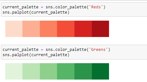
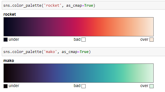
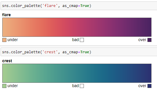
Since these palettes represent numeric values, the best sequential palettes are perceptually uniform. There are four perceptually sequential colormaps:
- rocket
- mako
These two are suitable for plotting heat maps since colors fill the space they are plotted into and are not suitable for lines and points as their extreme values are almost white. Example:
- flare
- crest
These are suitable for coloring lines and points.
Diverging palettes
These palettes use two values. They represent data where the high and low values span a midpoint, often zero. For instance, in a range from -5 to 5, values from -5 to 0 take one color, and 0 to 5 take another.
Example:
sns.color_palette("vlag", as_cmap=True)
Setting default color palette
We set the default color palette with the set_palette() method which takes in similar arguments like color_palette().
df = pd.read_csv('Students data.csv')
sns.lineplot(x='Algebra', y='GPA', data=df)
sns.set_style('white')
sns.set_palette('flare')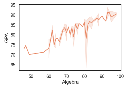
Creating multiple plots with Seaborn
Matplotlib provides add_axes(), subplot() and subplot2grid() to plot multiple plots, Seaborn provides FacetGrid() and PairGrid() to plot multiple plots.
Multi plots with FaceGrid()
We use this class when we want to visualize the relationship between multiple variables individually within subsections of our dataset. The class is drawn with a maximum of three dimensions: row column and hue. The hue represents the third dimension along a depth axis where different subsets of data are plotted with different colors.
Initialize a FacetGrid object with a DataFrame and the variables that will form these grid dimensions.
After initializing the FacetGrid object, we use the FacetGrid.map() function to apply more than one plotting function to each subset of the data in a facet.
Syntax:
seaborn.FacetGrid( data,
		row=None,
        col=None,
        hue=None,
        height=3,
        aspect=1,
        palette=None,
**kwargs)- data: DataFrame where each column is a variable and each row an observation.
- row, col, hue: they define subsets of the data, which will be drawn on separate facets in the grid.
- hue: variable in the
datato map plot aspects with different colors. - palette: colors to use for different levels of the
huevariable. - height: height of each facet in inches.
- aspect: Aspect ratio of each facet, so that
aspect * heightgives the width of each facet in inches.
Example 1:
df = pd.read_csv('Students data.csv')
plot = sns.FacetGrid(df, col='class', hue='gender', height=4.5, aspect=1)
plot.map(plt.scatter, "GPA", 'Calculus1')
plot.add_legend() # add a single legend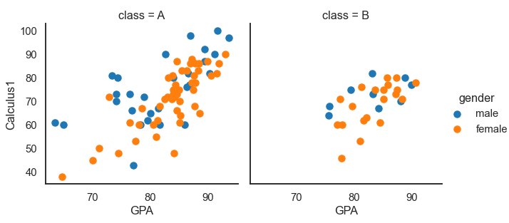
Multiple plots are drawn in different colors when we set the hue parameter.
Example 2:
df = pd.read_csv('Students data.csv')
plot = sns.FacetGrid(df, row= 'gender', col='class', height=3.5, aspect=1)
plot.map(plt.hist, "GPA", bins=10, color='green')
plot.add_legend()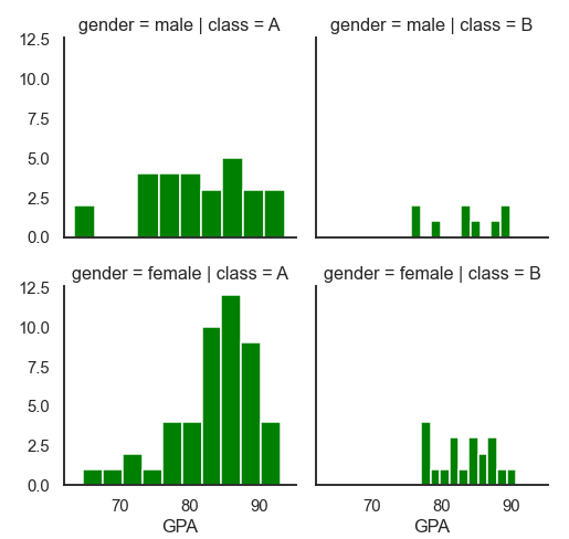
Multi plots with PairGrid()
PairGrid() is a subplot for plotting pairwise relationships in a dataset. It is more flexible and allows quick drawing of a grid of small plots using the same plot type.
Each row and column is assigned to a different variable, so the resulting plot shows each pairwise relationship in the dataset.
Its usage is similar to FacetGrid() in that, we initialize the grid and then pass the plotting function to a map method. It differs from FacetGrid() in that, in FacetGrid(), each facet shows the same relationship conditioned on different levels of other variables, while in PairGrid() each plot shows a different relationship.
Syntax:
seaborn.PairGrid( data,
		hue=None,
        palette=None,
        vars=None,
        height=3,
        aspect=1,
        dropna=False,
**kwargs)- data: DataFrame.
- hue: variable in the
datato map plot aspects with different colors. - palette: a set of colors.
- vars: variables with data to use.
- dropna: drops missing values from the data before plotting.
Example:
data = sns.load_dataset("iris") # built in dataset
plot = sns.PairGrid(data)
plot.map(sns.scatterplot)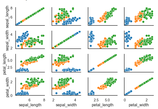
The map() method draws a bivariate plot on every Axes. We can show the marginal distribution for each variable on the diagonal with map.diag() and map.offdiag() methods.
data = sns.load_dataset("iris")
plot = sns.PairGrid(data, height=1.5,aspect=1.5, hue="species")
plot.map_diag(sns.histplot)
plot.map_offdiag(sns.scatterplot)
plot.add_legend()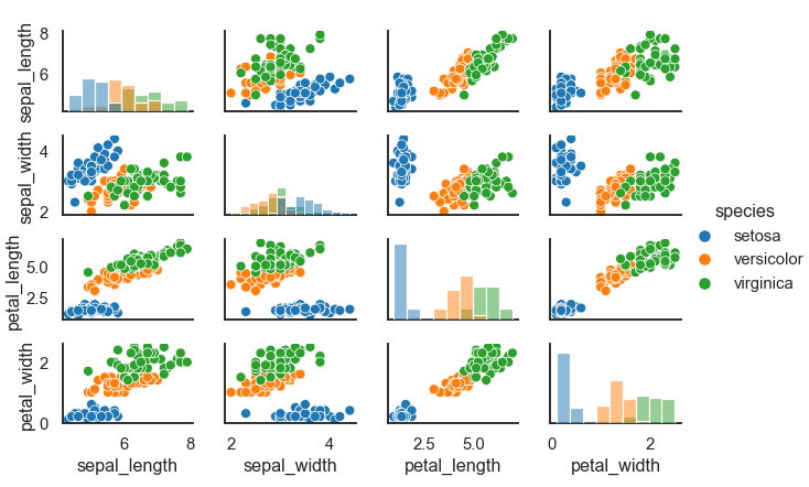
Relational plots with Seaborn
Seaborn provides three functions we use to draw relational plots. We will discuss them in detail in this section. These functions are:
relplotscatterplotlineplot
The relplot function
This is a figure-level function for drawing plots onto a FacetGrid. It provides access to several axes-level functions that display the relationship between two variables with a semantic mapping of subsets.
Syntax:
seaborn.relplot(x=None,y=None,hue=None,size=None,style=None,data=None, row=None,col=None,palette=None,kind='scatter',height=5, aspect=1, **kwargs) The kind argument is used with two other approaches– the scatterplot() and lineplot(). The default kind in relplot() is a scatterplot.
The relationship between x and y can be shown for different sunsets of the data with hue, size, and style parameters.
Let's show data points in the Student's data dataset:
df = pd.read_csv('Students data.csv')
sns.relplot(x= 'GPA', y='Calculus1', data=df)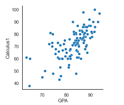
Adding another dimension where the data points will be colored according to the third variable. In this case, the gender variable. We can also say that we are grouping the data points based on category:
# grouping on the basis of a categroy
df = pd.read_csv('Students data.csv')
sns.relplot(x= 'GPA', y='Calculus1', hue='gender', data=df)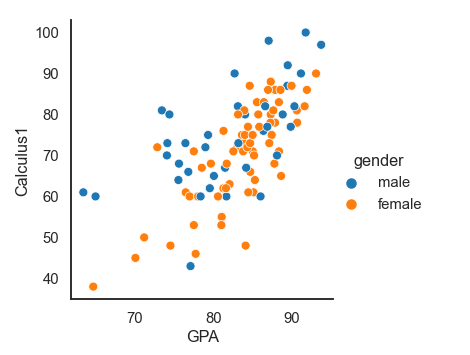
Creating a faceted figure by adding a col variable:
# grouping on the basis of a categroy
df = pd.read_csv('Students data.csv')
sns.relplot(x= 'GPA', y='Calculus1', height=3.5, hue='gender', row='gender', col='class', data=df)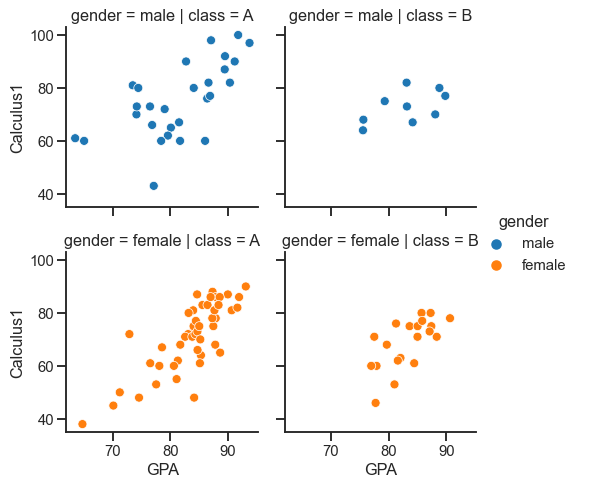
Using relplot() with kind parameter:
df = pd.read_csv('Students data.csv')
sns.relplot(x= 'Calculus1', y='GPA',kind='line', data=df)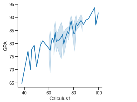
The scatterplot() function
A scatter plot represents the relationship and nature of two variables.
Syntax:
seaborn.scatterplot(x=None, y=None, data=None, **kwargs)Example:
df = pd.read_csv('Students data.csv')
markers = {"male": 'D', "female": 'X'}
sns.scatterplot(x= 'Calculus1', y='Calculus2', style='gender', hue='gender', markers=markers, data=df)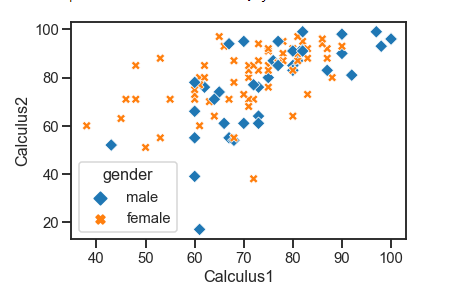
The lineplot() function
We use line plots to represent some datasets where we want to consider changes as a function of time or a continuous variable.
Syntax:
seaborn.lineplot(x=None, y=None, data=None, **kwargs)Let's visualize the exercise dataset:
exercise = sns.load_dataset('exercise')
sns.lineplot(x='time', y='pulse', hue='kind', style='diet', data=exercise)

exercise.head(3) # Overview of the data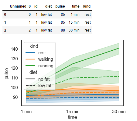
Categorical plots with Seaborn
Categorical plots are used to visualize the relationship between numerical data. In relational plots, we visualized relationships between multiple values. However, if one of the main variables is divided into discrete groups, we might need to use a more specialized approach to visualization.
Seaborn has some axes-level functions for plotting categorical data in different ways. The categorical plots, which we will discuss in detail, are grouped into three families, which include:
Categorical scatter plots:
- strip plot:
kind='strip'. - swarm plot:
kind='swarm'.
Categorical distribution plots:
- boxplot:
kind="box". - violin plot:
kind="violin". - boxen plot:
kind="boxen".
Categorical estimation plots:
- point plot:
kind="point" - bar plot:
kind="bar" - count plot:
kind="count"
The catplot() method is a figure-level interface that uses a scatterplot and gives access to these groups with the kind argument.Example:
df = pd.read_csv('Students data.csv')
sns.catplot(x="gender", y="GPA", data=df,kind='swarm', aspect=1.2)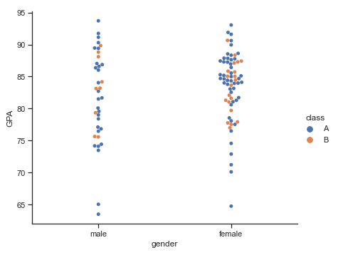
stripplot()
Draws a scatterplot based on a category. The function always treats one of the variables as categorical and plots the data on the relevant axis, even when the data has a numeric or date type.
Example:
# stripplot()
df = pd.read_csv('Students data.csv')
sns.set_context('talk', font_scale=1)
ax = sns.stripplot(x="gender", y="GPA", hue="class", palette="Set2", data=df)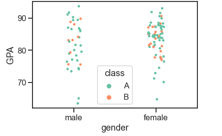
swarmplot()
This function is similar to the strip plot except that it adjusts the point, so it draws a scatterplot with non-overlapping points. Swarmplots do not scale up well with large numbers. So sometimes, when we want to visualize data with them, we combine them with a violin plot.
Example:
df = pd.read_csv('Students data.csv')
sns.swarmplot(x="gender", y="Calculus2", hue="class",order=["female", "male"], data=df)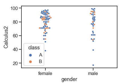
Swarmplot on a violin plot:
df = pd.read_csv('Students data.csv')
sns.violinplot(x="gender", y="Calculus2", data=df) # violinplot
sns.swarmplot(x="gender", y="Calculus2", hue="class",order=["female", "male"], data=df)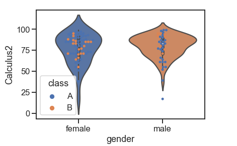
boxplot()
A boxplot, also called a box and whisker, shows the distribution of quantitative data from which we can make comparisons between variables. The box displays the quartiles of the dataset while the whiskers extend to show the rest of the distribution. Dots represent outliers.
Example:
df = pd.read_csv('Students data.csv')

sns.boxplot(x="class", y="GPA", hue="gender",
                 data=df, palette="Accent_r", linewidth=2.5)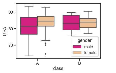
violinplot()
While all the components in a boxplot correspond to actual data points, a violin plot represents a kernel density estimation of the underlying distribution.
While all the components in a boxplot correspond to actual data points, a violin plot represents a kernel density estimation of the underlying distribution.
# violin plot
sns.set_theme(style="whitegrid")
penguins = sns.load_dataset('penguins')
sns.violinplot(x="species", y="flipper_length_mm", hue='island',
                    data=penguins, palette="muted")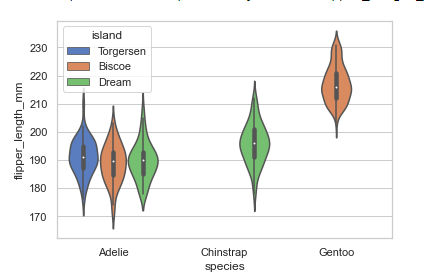
Combining violin plot with a FacetGrid to allow grouping within more categorical variables:
# violin plot and FacetGrid

sns.set_theme(style="whitegrid")
penguins = sns.load_dataset('penguins')
plot = sns.catplot(x="species", y="flipper_length_mm",col='sex', hue='island',
                    data=penguins, kind='violin', height=4.5, aspect=1)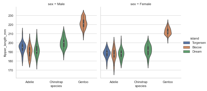
boxenplot()
A boxen plot shows many quantiles defined as “letter values” and is similar to a box plot in that all features correspond to actual observations. It gives extra information about the shape of the distribution, particularly in the tails, by plotting more quartiles.
#boxen plots
sns.set_theme(style="whitegrid")
penguins = sns.load_dataset('penguins')
sns.boxenplot(x="species", y="flipper_length_mm", hue='island', linewidth=1.5,
                    data=penguins)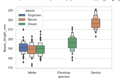
Combining boxen plot with a FacetGrid to allow grouping within more categorical variables:
# boxen plot and FacetGrid
sns.set_theme(style="whitegrid")
penguins = sns.load_dataset('penguins')
plot = sns.catplot(x="species", y="flipper_length_mm",col='sex', hue='island',
                    data=penguins, kind='boxen', height=4.5, aspect=1)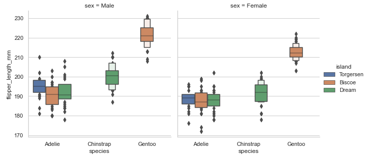
Using strip plot to show data points on the boxen plot:
#boxen plots with stripplot

sns.set_theme(style="whitegrid")
penguins = sns.load_dataset('penguins')
sns.catplot(x="species", y="body_mass_g", hue='island',
                    data=penguins, kind='boxen', height=5, aspect=1.4)
sns.stripplot(x="species", y="body_mass_g", data=penguins,
                   color="k")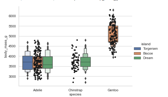
pointplot()
A point plot shows an estimate of the central tendency for a numeric variable by the position of scatter plot points and demonstrates the uncertainty around that estimate using error bars. With the lines that join each point from the same hue level, we can judge interactions by differences in the slope, which is much simpler than comparing the heights of several groups of points, like in bar plots.
Point plots show only the mean or other estimator values. If you want to show the distribution of values at each level of the categorical variables, violin and box plots may be your best bet.
#point plots
penguins = sns.load_dataset('penguins')
sns.pointplot(x="species", y="body_mass_g", hue='sex', markers=["o", "x"],
                   linestyles=["-", "--"],
                    data=penguins)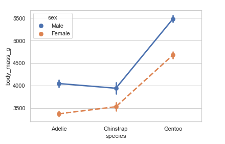
Using median to estimate central tendency:
from numpy import median
penguins = sns.load_dataset('penguins')
sns.pointplot(x="species", y="body_mass_g", estimator=median, data=penguins)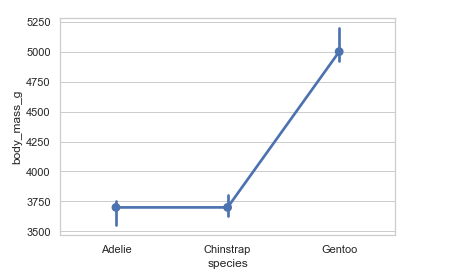
Showing standard deviation of observations:
# Showing standard deviation and setting capsize
penguins = sns.load_dataset('penguins')
sns.pointplot(x="species", y="body_mass_g", ci='sd', capsize=.3, data=penguins)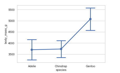
barplot()
A bar plot shows an estimate of the central tendency for a numeric variable. Bar plots represent data in rectangular bars where the length of each bar represents the proportion of the data in that category. They show the mean or other estimator values.
# bar plot
penguins = sns.load_dataset('penguins')
sns.barplot(x="species", y="body_mass_g", hue='sex', capsize=.3, data=penguins)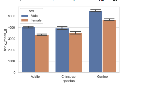
Showing the standard error of the mean:
penguins = sns.load_dataset('penguins')
sns.barplot(x="species", y="body_mass_g",ci=68, capsize=.3, data=penguins)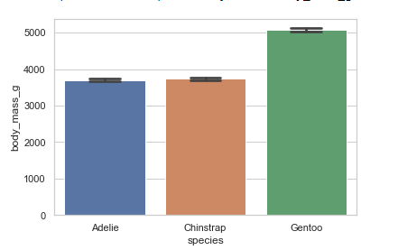
countplot()
Count plots show the counts of observations in each categorical bin using bars.
Showing count for categorical variables:
plt.figure(figsize=(10, 5))
penguins = sns.load_dataset('penguins')
sns.countplot(x='species', hue='sex', data=penguins)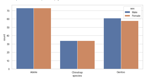
Using different color palettes:
plt.figure(figsize=(10, 5))
penguins = sns.load_dataset('penguins')
sns.countplot(x='species', palette='CMRmap', data=penguins)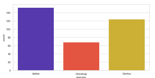
Using matplotlib.axes.Axes.bar() to control the style:
# Using matplotlib.axes.Axes.bar()

plt.figure(figsize=(10, 5))
penguins = sns.load_dataset('penguins')
sns.countplot(x='species', data=penguins, facecolor=(0, 0, 0, 0),
              edgecolor=sns.color_palette("bright"), linewidth=6)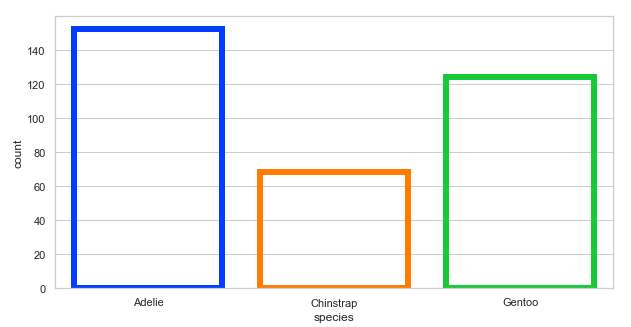
Distribution plots with Seaborn
Distribution plots are used to evaluate bivariate and univariate distributions. We will discuss the following types of distribution plots:
distplot: Figure-level interface for drawing distribution plots onto a FacetGrid.histplot:kind='hist().kdeplot:kind='kde'.
displot()
A distplot is the figure-level interface we can use to draw distribution plots on a FacetGrid. The function provides access to methods for visualizing bivariate and univariate data. In its kind argument, we use either hist for histplot(), which is the default, or kde for kdeplot(), which we shall discuss.
Example:
penguins = sns.load_dataset("penguins")
sns.displot(data=penguins, x="bill_length_mm", height=4.3, aspect=1.6)
# we can set the height and aspect above
# since the figure is drawn with a FacetGrid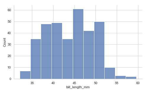
Using the kind parameter. We will discuss KDE plots later:
penguins = sns.load_dataset("penguins")
sns.displot(data=penguins, x="bill_length_mm", height=4.3, aspect=1.6, kind='kde')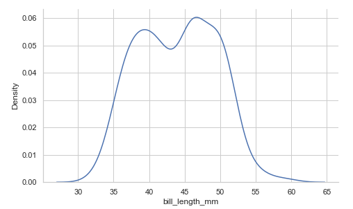
Drawing a bivariate plot. We specify x and y:
penguins = sns.load_dataset("penguins")
sns.displot(data=penguins, x="bill_length_mm",
            y='flipper_length_mm', height=4.3, aspect=1.6, kind='kde')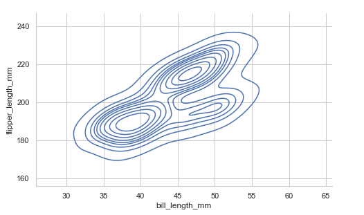
Adding the hue mapping:
penguins = sns.load_dataset("penguins")
sns.displot(data=penguins, x="bill_length_mm",
            height=4.3, aspect=1.6, hue='island', kind='kde')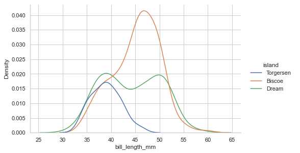
Since distplot() draws with FacetGrid, we can give the col value to have multi-plots:
penguins = sns.load_dataset("penguins")
sns.displot(data=penguins, x="bill_length_mm",
            height=4.3, aspect=1, hue='island',col='sex', kind='kde')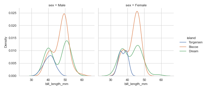
histplot()
histplot() method plots histograms representing data by the number of observations within discrete bins. With the histplot() function, we can add a smooth curve over the histogram bins, which we achieve by using the Kernel Density Estimate(KDE).
Example:
plt.figure(figsize=(10, 5))
penguins = sns.load_dataset("penguins")
sns.histplot(data=penguins, x="flipper_length_mm", bins=20) # you can add binwidth(binwidth=4), number of bins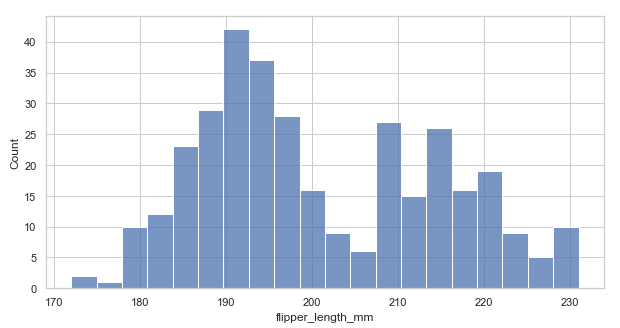
Adding a KDE(kde=True) to smoothen the histogram and provide more information about the shape of the data:
plt.figure(figsize=(10, 5))
penguins = sns.load_dataset("penguins")
sns.histplot(data=penguins, x="flipper_length_mm", bins=20, kde=True) # set kde=True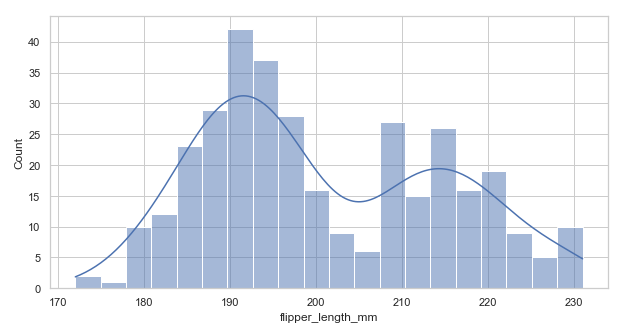
Adding hue mapping for multiple histograms:
plt.figure(figsize=(10, 5))
penguins = sns.load_dataset("penguins")
sns.histplot(data=penguins, x="flipper_length_mm", hue='species', bins=20) # set hue
When we add the hue mapping, the histograms are layered on each other. Sometimes this layering can make it hard to distinguish the bars. We can solve this by adding either of the parameters below:
element='step': changes the plots to a step plot.multiple='stack': stacks the bars or moves them up. This can sometimes conceal some features but is helpful.multiple='dodge': moves the bars horizontally and reduces their width.
Example with multiple='dodge'. Using the above code:
# re-arrangement of the bar with hue mapping

plt.figure(figsize=(10, 5))
penguins = sns.load_dataset("penguins")
sns.histplot(data=penguins, x="flipper_length_mm", hue='species', bins=20, multiple='dodge') # set dodge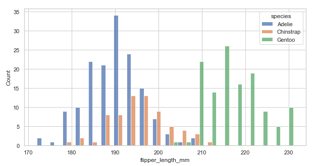
The arrangement is a bit clear now! Try the other parameters now.
A small change in appearance. Setting the fill=False to get unfilled bars:
plt.figure(figsize=(10, 5))
penguins = sns.load_dataset("penguins")
sns.histplot(data=penguins, x="flipper_length_mm", binwidth=2, fill=Fals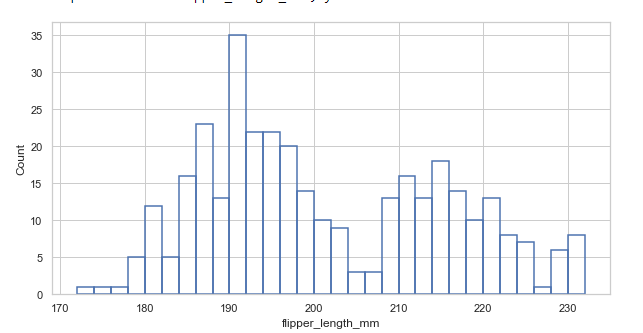
kdeplot()
Kernel Density Estimate(KDE) plot is similar to a histogram. The histogram represents data with discrete bins and counting observations. In contrast, KDE represents the data using a continuous probability density curve in one or more dimensions, producing a continuous density estimate.
Example:
plt.figure(figsize=(10, 5))
penguins = sns.load_dataset("penguins")
sns.kdeplot(x='body_mass_g', data=penguins)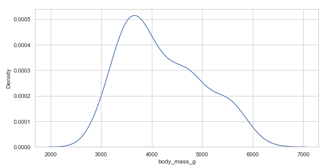
Conditional distribution with hue mapping:
plt.figure(figsize=(10, 5))
penguins = sns.load_dataset("penguins")
sns.kdeplot(x='body_mass_g', hue='species', data=penguins)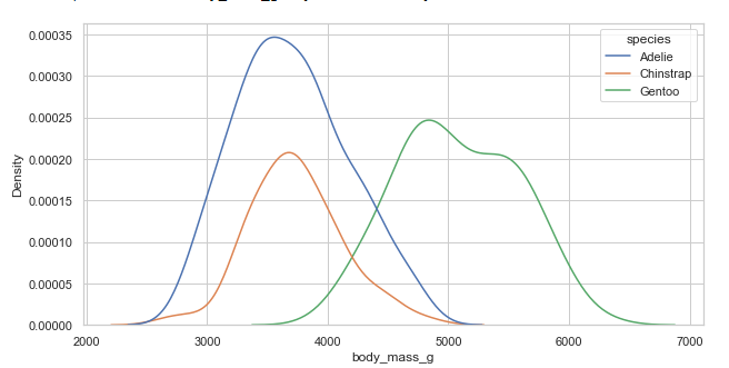
Selecting smoothing bandwidth(bw_adjust)
We select a smoothing bandwidth with the bw_adjust parameter.
Example 1:
# less smooth bandwidth
plt.figure(figsize=(10, 5))
penguins = sns.load_dataset("penguins")
sns.kdeplot(x='body_mass_g', data=penguins, bw_adjust=0.15) # selecting bandwidth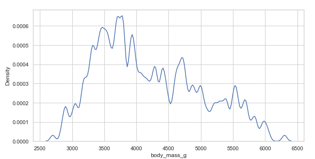
Example 2:
# Over smooth bandwidth

plt.figure(figsize=(10, 5))
penguins = sns.load_dataset("penguins")
sns.kdeplot(x='body_mass_g', data=penguins, bw_adjust=3) # selecting bandwidth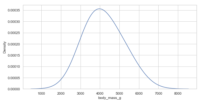
Regression plots with Seaborn
Regression plots are meant to add a visual guide to emphasize patterns in a dataset during exploratory analyses. These plots create a regression line between two variables which helps visualize their linear relationship.
lmplot()
This method creates a linear model and scatter plot with a linear regression fit.
Example:
penguins = sns.load_dataset("penguins")
sns.lmplot(x='body_mass_g', y="flipper_length_mm", aspect=1.3,data=penguins)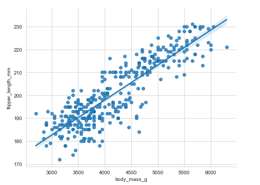
Adding a third variable hue:
penguins = sns.load_dataset("penguins")
sns.lmplot(x='body_mass_g', y="flipper_length_mm", aspect=1.3,data=penguins, hue='island')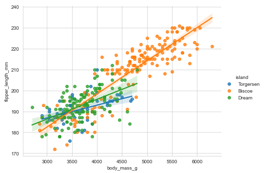
Adding markers:
penguins = sns.load_dataset("penguins")
sns.lmplot(x='body_mass_g', y="flipper_length_mm", aspect=1.3,data=penguins, hue='sex', markers=["o", "x"])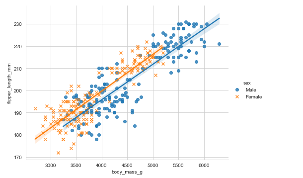
regplot()
regplot() is similar to lmplot() and plots a linear regression model fit.
Example:
# regplot()
plt.figure(figsize=(8, 5))
penguins = sns.load_dataset("penguins")
sns.regplot(x='body_mass_g', y="flipper_length_mm",data=penguins)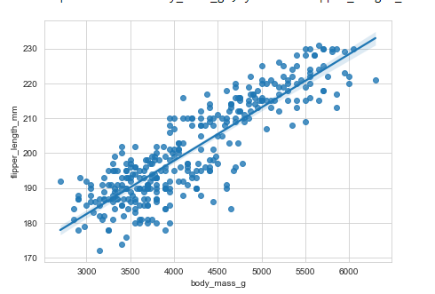
You will notice that regplot() is closely similar to lmplot(). There are several mutually exclusive options for estimating the regression model. Use this link to get extensive information about their differences.
Matrix plots
Matrix plots show relationships between several groups of variables at once. They include:
- Heatmap.
- Cluster map.
Heatmap
The heatmap is created with the heatmap() function, which plots data on a rectangular form in a color-encoded matrix. The heatmap represents higher values with brighter colors and lower values with darker colors.
Plotting a heatmap requires that the index name and the column name in the data be related in a way that means the data should be in a matrix form.
Example:
sns.set_context('talk', font_scale=0.9)
penguins = sns.load_dataset("penguins")
# correlation between variables
corr = penguins.corr()
sns.heatmap(corr)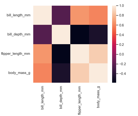
Annotating each cell with the numeric value with integer formatting, adding lines and colormap:
plt.figure(figsize=(7, 6))
sns.set_context('talk', font_scale=0.9)
penguins = sns.load_dataset("penguins")
# correlation between variables
corr = penguins.corr()
sns.heatmap(corr, annot=True, cmap='plasma', linewidth=2.5, linecolor ='white')
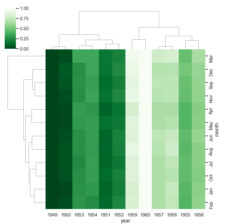
Cluster map
Cluster maps perform hierarchical clustering based on the similarity of columns and rows. We use the clustermap() method to create cluster maps.
Example:
flights = sns.load_dataset("flights")
data_frame = pd.pivot_table(values ='passengers',
                    index ='month', columns ='year', data = flights)
sns.clustermap(data_frame, cmap='Greens_r', standard_scale=.4)
Final thoughts
This tutorial has covered many concepts you will encounter as you continue visualizing with Seaborn. We have seen how simpler it is to plot various plots with Seaborn than with Matplotlib. We have covered:
- Loading and using Seaborn's built-in datasets and Pandas DataFrames.
- Changing figure aesthetics in Seaborn plots.
- Dealing with Seaborn themes and color palettes.
- Building various plots with Seaborn
- Other great concepts within the different topics.
The Complete Data Science and Machine Learning Bootcamp on Udemy is a great next step if you want to keep exploring the data science and machine learning field.
Follow us on LinkedIn, Twitter, and GitHub, and subscribe to our blog, so you don't miss a new issue.